• 19 March, 2023

    SportNation

    HORSE RACING PAGE REDESIGN

    Introduction

    Sportnation.bet was using the sportsbook betting  platform provided by SBTech.

    As part of our strategy to improve our customer experience, we focused in the most popular sports in the UK, and started working into improving the web layouts designs provided by the Sbtech platform.

    Once finished these designs will give us a differentiation point from other competitors using the same platform.


    Workshop findings

    Off the back of the meeting, the conclusions were that the designs should be let by:

    • Immediacy: what can I bet on the next 3 races, mobile event scroller, highlighting the times of the next races that will be starting.
    • Marketing: The ability to show Main events/highlights, specials, and visual representation in the race’s layout for extra place/offer races
    • Trading: The ability to show derivative markets easily (match bets, place only etc)


    New structure/layout for the horse racing branch

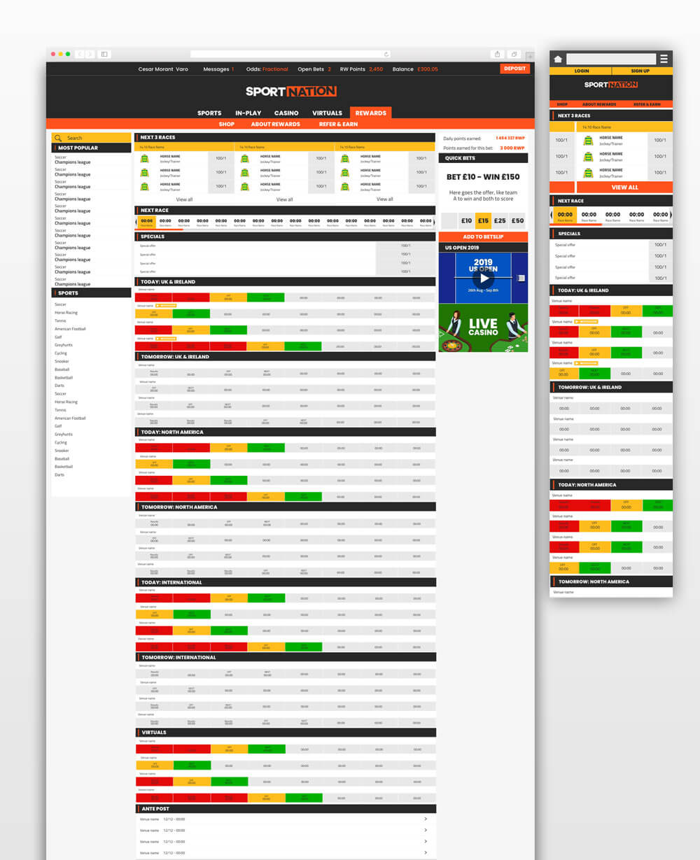
    The problem we had was that key events were hidden behind tabs. Although we didn’t currently have International racing on site, it was an intention in the future, and whilst the events were hidden behind a tab, they weren’t particularly accessible. The same issue could be said for “Tomorrow” and “Future” racing hidden behind their respective tabs.

    With that in mind, we changed the layout so that the categories are all on 1 page, in sections, that the user could scroll through.


    Design process

    We did a market research of main competitors the look for good examples of what we were trying to achieve. Competitors Bet365.com and Marathonbet had features that we thought would benefit and improve the page and we decided to take inspiration from them.

    Secondly we proceed to create wireframes designs with all the new features, Next Race block, Special offer block, then The Races blocks organised by date and location.

    Once we were happy with the design we proceed adding colours and final touches. We used 3 colours to define the status of the race: green for incoming, yellow for active and red for finished.  Which make very visual for the user to find the stages of the races at any point and improved considerably the exposer of other markets that were hide in the original design.

    REWARDS PROGRAM STORE

    Introduction

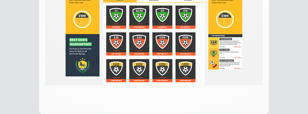
    Sportnation is an online bookmaker operating in the UK, known for its Rewards Programme: loyalty offer, where everytime you bet or play in a casino, you’ll earn points, just like air miles or a store card. The more selections you make and the higher the stake, the more you’ll earn. Regardless of whether you win or lose.

    We designed a store where clients could spend their points on a variety of prizes: free bets, free spins, special offers or cash.

    The programme was nominated for 2019 EGR Operator Awards in the category “Product of the year”.


    Design Process

    Originally, the store was supposed to include mostly physical items (eg. electronics, watches or gadgets). At this point we where outsorcing the store, we had too many products and it was costing us a percentage per each product.

    We decided to do a bit of research with the customers find out what they really wanted as a rewards.

    We sent  questionaries via email during several weeks offering Free Bets to incentivise the participation. The research showed physical prizes where not very popular, and people preferred free spins, free bets or vouchers.

    With this inputs  we decided to redesign the store focusing on free spins, free bets, bonuses and significantly narrow the items section. Later in the process, the items were completely dropped with the plan to add more options in the future.

    Other challenge we focused is to make the shop intuitive an easy to navigate. We aimed for a simple design, using badges that represented the prizes, with the main info visible at all times and using drop downs for full descriptions and terms. We wanted to avoid redirecting to subpages or having popups as we had in  the previous store so we keep everything in one page to improve the user experience

    First, we agreed on a wireframe. We chose a simple, clean grid layout with easily recognisable icons to identify different values. Based on that we designed the final layout for the stores main page and checkout.


    PICK A PONY PREDICTOR

    Introduction

    These started as a Campaign for the Cheltenham festival and due to popularity became a regular feature in the Sportnation site.  I

    It consist in a prediction game of Horse vs Horse in a selection of races.

    Depending of how many you get right it was a table and prizes for the top winners.


    Design Process

    We wanted to create a horse racing game that was very simple. Horse races could be complicated due to the amount of horses per race, so we came with the idea of picking only 2 horses in each race and and make a 1vs1 predictor game.
    We started with researching Similar games on player vs player or team vs team.
    We designed wireframes to hold all the info we required and created blocks for the horses and for the results in between.
    We added the functionality of adding to the bet slip the choices of the players.
    The result was a very simple game that helped creating awareness on horse racing, increased the retention rates, generated revenue and differentiate us from other competitors.

    SPORTNATION AFFILATE SITE

    Introduction

    Affiliate sites are all similar and frankly, boring to look at, some have too much information, some simply just have text. We set out to create an interesting site that is on brand and provide clear information on offers and bonuses.

    The users included existing Sport Nation and cross-sell customers from other brands within EEG as well as from other companies that wanted to get traffic to their websites.


    Design Process

    We started with researching numerous affiliate sites to see the commonalities and what set some apart from the rest.
    After the research we stablished that 2 parts where needed. The first one and main focus will be the one with the offers, and the second one a blog where we could add content to attract organic users and help us with the website ranking.
    Another thing we realised in the research stage was that some sites used grid layouts and others with list layouts for the offers but none of them offered the option to switch between them, so we saw and area of improving the user experience here.

    We  took the design further by adding different banners with offers for different types of sports and colour coded them, for example, football would be yellow, horse racing would be green, casino would be blue and a mix of all the colours for the main landing page before a sport is selected. We also added highlights for the top 3 offers this way the site is showing the best 3 deals regardless of filtering.

    CASINONATION

    Introduction
    Affiliate sites are all similar and frankly, boring to look at, some have too much information, some simply just have text. We set out to create an interesting site that is on brand and provide clear information on offers and bonuses.

    The users included existing Sport Nation and cross-sell customers from other brands within EEG as well as from other companies that wanted to get traffic to their websites.


    Design Process

    We started with researching numerous affiliate sites to see the commonalities and what set some apart from the rest.
    After the research we stablished that 2 parts where needed. The first one and main focus will be the one with the offers, and the second one a blog where we could add content to attract organic users and help us with the website ranking.
    Another thing we realised in the research stage was that some sites used grid layouts and others with list layouts for the offers but none of them offered the option to switch between them, so we saw and area of improving the user experience here.

    We  took the design further by adding different banners with offers for different types of sports and colour coded them, for example, football would be yellow, horse racing would be green, casino would be blue and a mix of all the colours for the main landing page before a sport is selected. We also added highlights for the top 3 offers this way the site is showing the best 3 deals regardless of filtering.

  • 6 March, 2023

    EGL NEW SITE

    ESPORTS GAMING LEAGUE NEW WEBSITE

    Esports Gaming League which is part of EEG had outsourced the website redesign prior to being acquired by EEG, they wanted to bring the project back in-house instead and that’s where the team came in to continue the redesign.

    The majority of users are already using the site, but we wanted to attract more players as well as entice former players back with a new website that’s more geared towards the Esports look.

    MAIN OBJECTIVES

    The main objective for a redesign is to bring the EGL frontend user interface up to the modern-day application standard. Ultimately, EGL wants a better website to attract new and former users who would benefit from the effortless use of the website to compete regularly in tournaments.

    Main areas that need redesign/improvements:

    1. Improve and “modernise” the current look, whilst still keeping our core themes/styles.

    2. Provide a friendlier and easier-to-use environment for players & teams.
    (Rounded buttons/boxes softer and less in-your-face typography etc).

    3. Improve user flows, and make competing on our tournament platform as simple as possible.

    4. Primary focus on the tournament side of the website, participation/matches/results etc. That is what people are there for.

    5. Keep feature parity with the current website. Adding to it when/where possible, but keeping in consideration the time/focus required to build new features.
    The problem with picking up an existing project is that we had to figure out the way the agency worked and how they set up the system on Figma, we found that their way was messy if we want to add more elements.
    COMPARISON

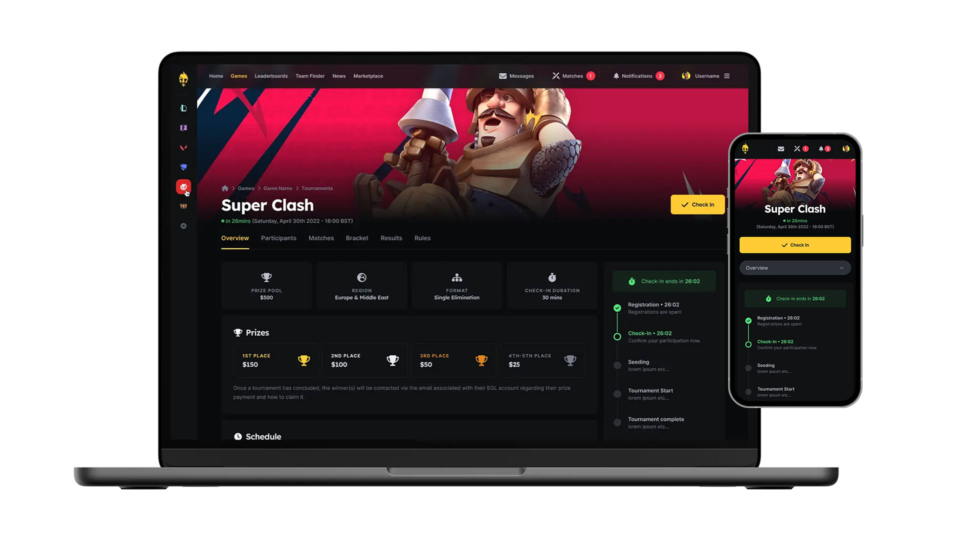
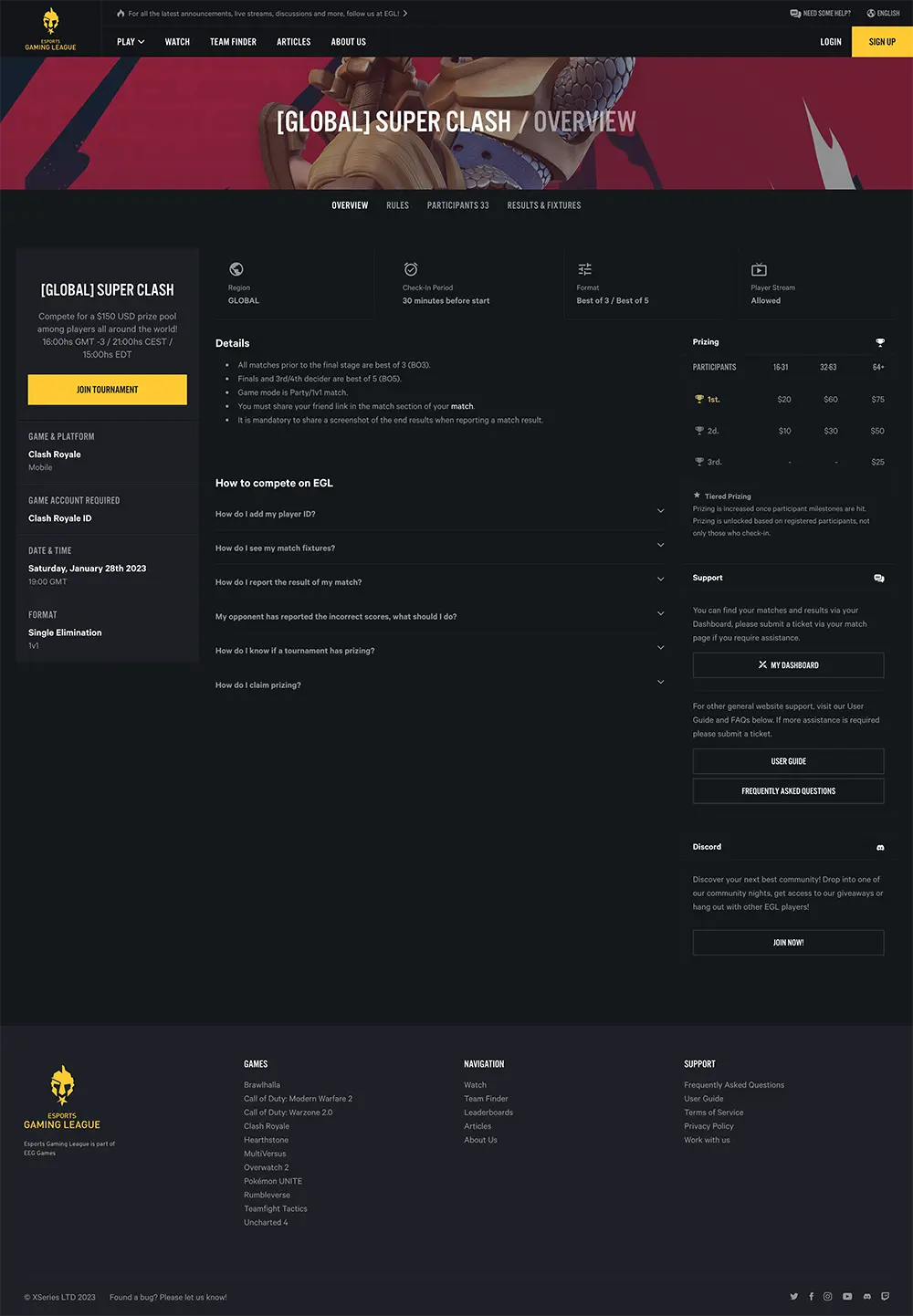
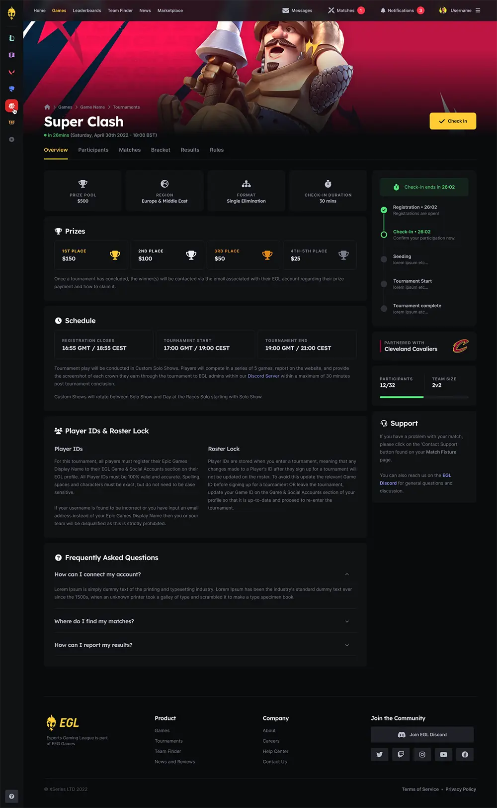
    A quick comparison of the Tournament Overview page left is the previous design and the right is new design. The new design clearly shows the sections, lists the prizes and other important information as well as the live information. The overall look is cleaner and more accessible for the users to see what they need to see immediately.
    WEBSITE OVERVIEW

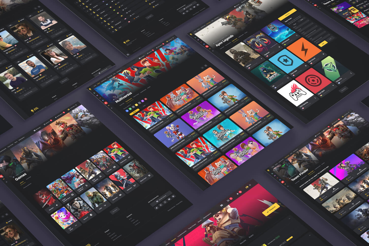
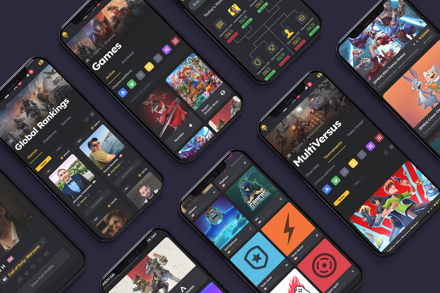
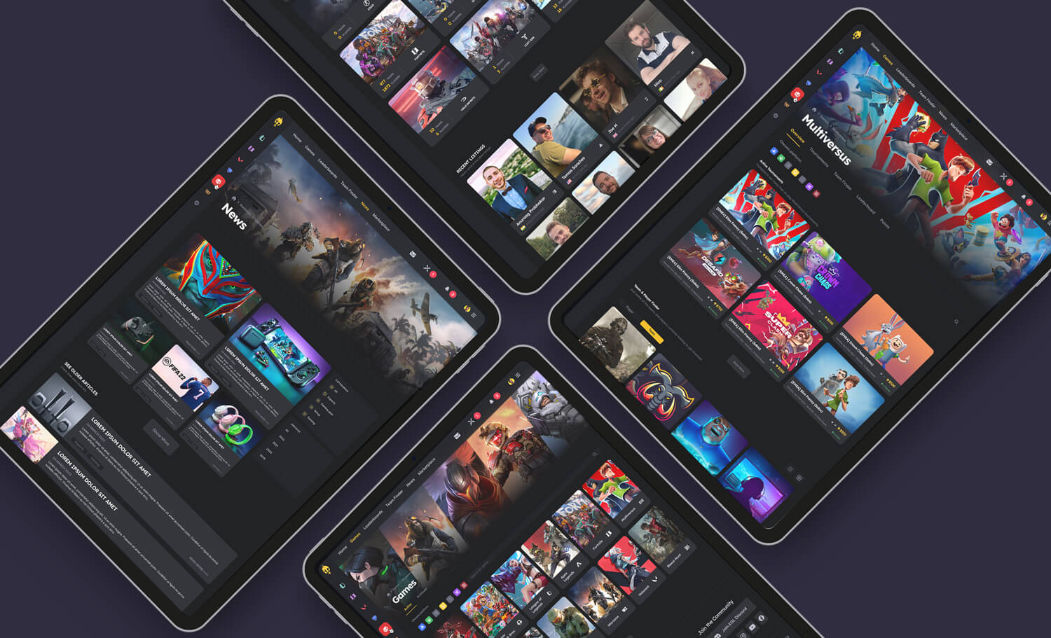
    Some screenshots of the main pages that we designed on Figma namely Games pages, Tournament pages, Team Finder pages, Ranking and User pages

  • 8 March, 2023

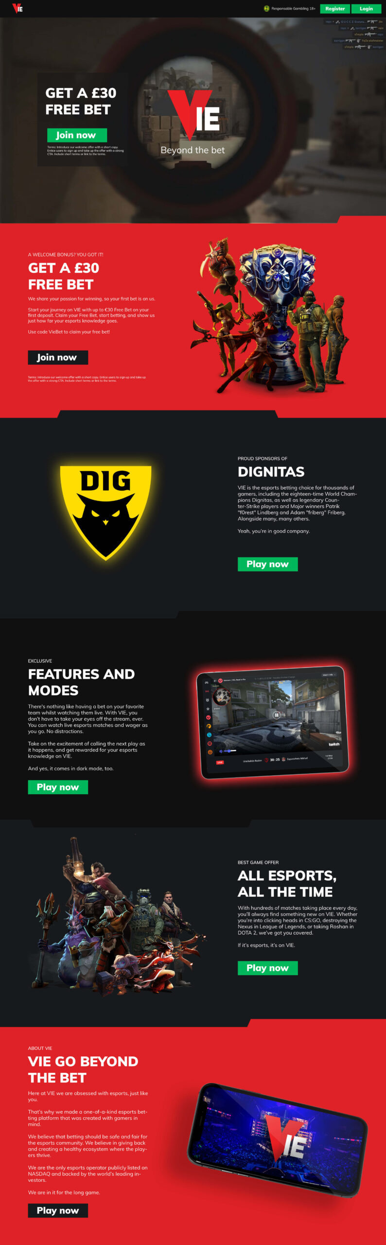
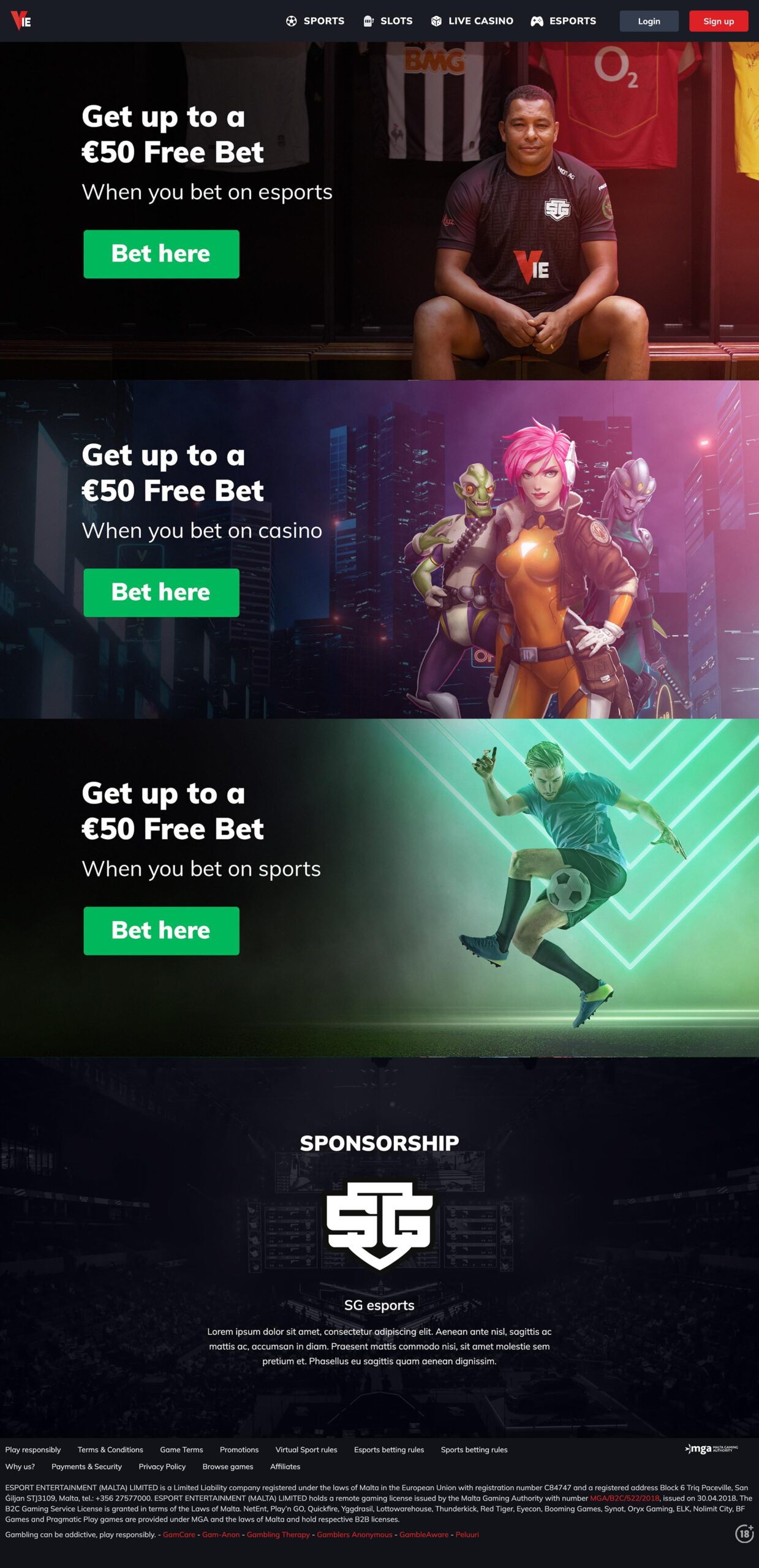
    Vie

  • 6 March, 2023

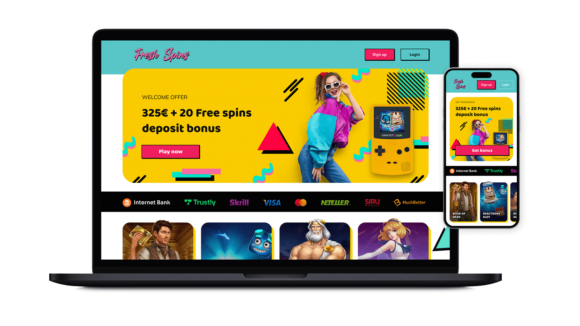
    Fresh Spins

  • 4 March, 2023

    Kirin

    KIRIN CRYPTO CASINO | BRANDING
    & UX/UI DESIGN

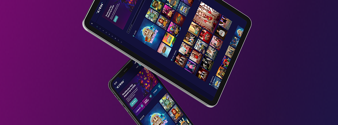
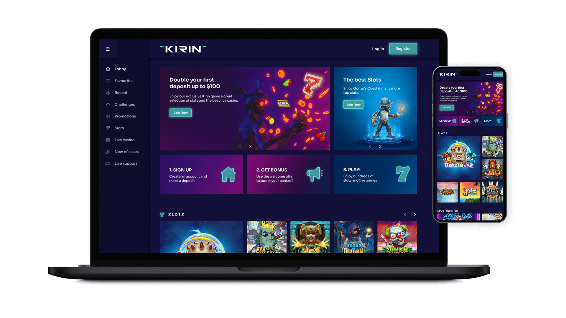
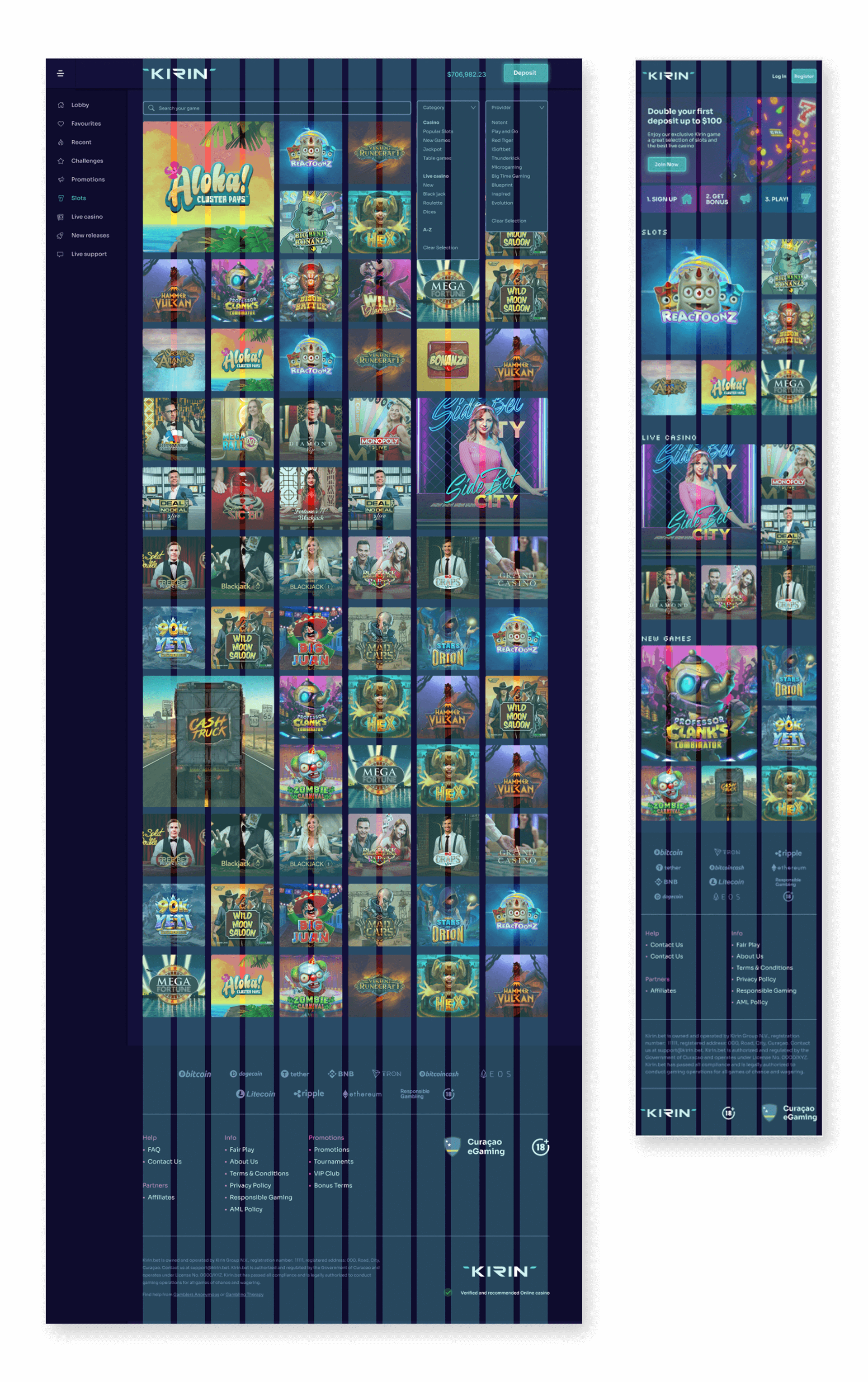
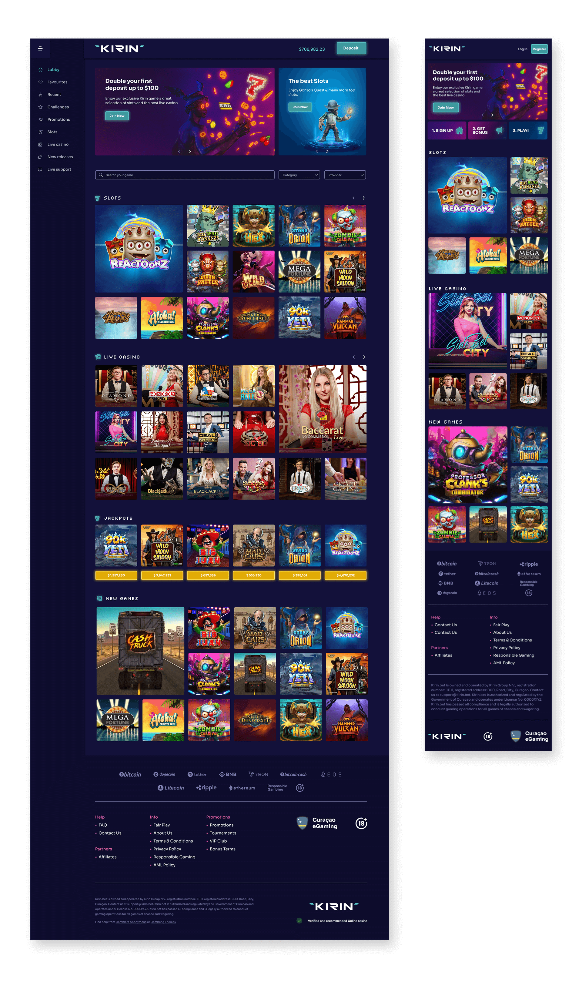
    This project was divided in 2 stages, branding and website design.

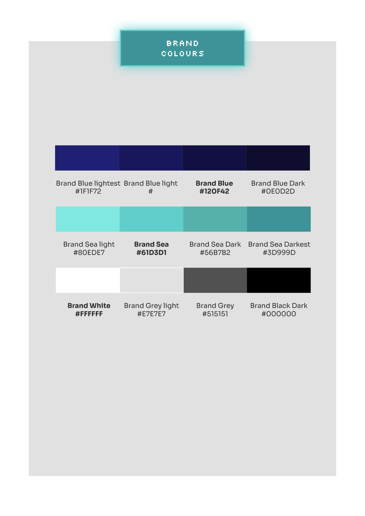
    For the branding we did a full exercise of several sessions to fully understand the business idea, the markets, the target audience, the areas of opportunity, the trends and the client preferences.

    Aliquam rutrum sem eu sapien bibendum efficitur. Donec nisl nunc, suscipit et sollicitudin sed, vulputate at urna. Proin tincidunt iaculis maximus. Praesent aliquam orci sed augue euismod, eu tincidunt quam convallis. Sed eget erat scelerisque, scelerisque odio eu, sodales dui. Sed sed enim sed enim rhoncus commodo. Nunc vehicula faucibus elit ac tempus. Nullam quis orci rhoncus, dignissim mi eget, placerat massa.

    I am text block. Click edit button to change this text. Lorem ipsum dolor sit amet, consectetur adipiscing elit. Ut elit tellus, luctus nec ullamcorper mattis, pulvinar dapibus leo.

    I am text block. Click edit button to change this text. Lorem ipsum dolor sit amet, consectetur adipiscing elit. Ut elit tellus, luctus nec ullamcorper mattis, pulvinar dapibus leo.

    I am text block. Click edit button to change this text. Lorem ipsum dolor sit amet, consectetur adipiscing elit. Ut elit tellus, luctus nec ullamcorper mattis, pulvinar dapibus leo.

    I am text block. Click edit button to change this text. Lorem ipsum dolor sit amet, consectetur adipiscing elit. Ut elit tellus, luctus nec ullamcorper mattis, pulvinar dapibus leo.

    I am text block. Click edit button to change this text. Lorem ipsum dolor sit amet, consectetur adipiscing elit. Ut elit tellus, luctus nec ullamcorper mattis, pulvinar dapibus leo.

    I am text block. Click edit button to change this text. Lorem ipsum dolor sit amet, consectetur adipiscing elit. Ut elit tellus, luctus nec ullamcorper mattis, pulvinar dapibus leo.

    I am text block. Click edit button to change this text. Lorem ipsum dolor sit amet, consectetur adipiscing elit. Ut elit tellus, luctus nec ullamcorper mattis, pulvinar dapibus leo.

  • 8 March, 2023

    EEG

  • 5 March, 2023

    Pocket Kajino

  • 8 March, 2023

    Redzone